Button (lv_btn)
Overview
Buttons are simple rectangle-like objects, but they change their style and state when they are pressed or released.
States
Buttons can be in one of the 5 possible states:
LV_BTN_STATE_REL - Released state
LV_BTN_STATE_PR - Pressed state
LV_BTN_STATE_TGL_REL - Toggled released state
LV_BTN_STATE_TGL_PR - Toggled pressed state
LV_BTN_STATE_INA - Inactive state
The state from ..._REL to ..._PR will be changed automatically when the button is pressed or released.
You can set the button’s state manually with lv_btn_set_state(btn, LV_BTN_STATE_TGL_REL).
Toggle
You can configure the buttons as toggle button with lv_btn_set_toggle(btn, true). In this case, on release, the button goes to toggled released state.
Layout and Fit
Similarly to Containers, buttons also have layout and fit attributes.
lv_btn_set_layout(btn, LV_LAYOUT_...)set a layout. The default isLV_LAYOUT_CENTER. So, if you add a label, then it will be automatically aligned to the middle and can’t be moved withlv_obj_set_pos(). You can disable the layout withlv_btn_set_layout(btn, LV_LAYOUT_OFF).lv_btn_set_fit/fit2/fit4(btn, LV_FIT_..)enables to set the button width and/or height automatically according to the children, parent, and fit type.
Ink effect
You can enable a special animation on buttons: when a button is pressed, the pressed state will be drawn in a growing circle starting from the point of pressing. It’s similar in appearance and functionality to the Material Design ripple effect.
Another way to think about it is like an ink droplet dropped into water. When the button is released, the released state will be reverted by fading. It’s like the ink is fully mixed with a lot of water and becomes invisible.
To control this animation, use the following functions:
lv_btn_set_ink_in_time(btn, time_ms)- time of circle growing.lv_btn_set_ink_wait_time(btn, time_ms)- minim time to keep the fully covering (pressed) state.lv_btn_set_ink_out_time(btn, time_ms)- time fade back to releases state.
This feature needs to be enabled with LV_BTN_INK_EFFECT 1 in lv_conf.h.
Styles
A button can have 5 independent styles for the 5 states. You can set them via: lv_btn_set_style(btn, LV_BTN_STYLE_..., &style). The styles use the style.body properties.
LV_BTN_STYLE_REL - style of the released state. Default:
lv_style_btn_rel.LV_BTN_STYLE_PR - style of the pressed state. Default:
lv_style_btn_pr.LV_BTN_STYLE_TGL_REL - style of the toggled released state. Default:
lv_style_btn_tgl_rel.LV_BTN_STYLE_TGL_PR - style of the toggled pressed state. Default:
lv_style_btn_tgl_pr.LV_BTN_STYLE_INA - style of the inactive state. Default:
lv_style_btn_ina.
When you create a label on a button, it’s a good practice to set the button’s style.text properties too. Because labels have style = NULL by default, they inherit the parent’s (button) style.
Hence you don’t need to create a new style for the label.
Events
Besides the Generic events the following Special events are sent by the buttons:
LV_EVENT_VALUE_CHANGED - sent when the button is toggled.
Note that, the generic input device-related events (like LV_EVENT_PRESSED) are sent in the inactive state too. You need to check the state with lv_btn_get_state(btn) to ignore the events from inactive buttons.
Learn more about Events.
Keys
The following Keys are processed by the Buttons:
LV_KEY_RIGHT/UP - Go to toggled state if toggling is enabled.
LV_KEY_LEFT/DOWN - Go to non-toggled state if toggling is enabled.
Note that, by default, the state of LV_KEY_ENTER is translated to LV_EVENT_PRESSED/PRESSING/RELEASED etc.
Learn more about Keys.
Example
C
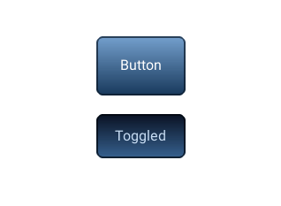
Simple Buttons
code
#include "lvgl/lvgl.h"
#include <stdio.h>

static void event_handler(lv_obj_t * obj, lv_event_t event)
{
    if(event == LV_EVENT_CLICKED) {
        printf("Clicked\n");
    }
    else if(event == LV_EVENT_VALUE_CHANGED) {
        printf("Toggled\n");
    }
}

void lv_ex_btn_1(void)
{
    lv_obj_t * label;

    lv_obj_t * btn1 = lv_btn_create(lv_scr_act(), NULL);
    lv_obj_set_event_cb(btn1, event_handler);
    lv_obj_align(btn1, NULL, LV_ALIGN_CENTER, 0, -40);

    label = lv_label_create(btn1, NULL);
    lv_label_set_text(label, "Button");

    lv_obj_t * btn2 = lv_btn_create(lv_scr_act(), NULL);
    lv_obj_set_event_cb(btn2, event_handler);
    lv_obj_align(btn2, NULL, LV_ALIGN_CENTER, 0, 40);
    lv_btn_set_toggle(btn2, true);
    lv_btn_toggle(btn2);
    lv_btn_set_fit2(btn2, LV_FIT_NONE, LV_FIT_TIGHT);

    label = lv_label_create(btn2, NULL);
    lv_label_set_text(label, "Toggled");
}
MicroPython
Simple Buttons
code
def event_handler(obj, event):
    if event == lv.EVENT.CLICKED:
        print("Clicked")

btn1 = lv.btn(lv.scr_act())
btn1.set_event_cb(event_handler)
btn1.align(None, lv.ALIGN.CENTER, 0, -40)

label = lv.label(btn1)
label.set_text("Button")

btn2 = lv.btn(lv.scr_act())
# callback can be lambda:
btn2.set_event_cb(lambda obj, event: print("Toggled") if event == lv.EVENT.VALUE_CHANGED else None)
btn2.align(None, lv.ALIGN.CENTER, 0, 40)
btn2.set_toggle(True)
btn2.toggle()
btn2.set_fit2(lv.FIT.NONE, lv.FIT.TIGHT)

label = lv.label(btn2)
label.set_text("Toggled")
API
Enums
-
enum [anonymous]
Possible states of a button. It can be used not only by buttons but other button-like objects too
Values:
-
enumerator
LV_BTN_STATE_REL¶ Released
-
enumerator
LV_BTN_STATE_PR¶ Pressed
-
enumerator
LV_BTN_STATE_TGL_REL¶ Toggled released
-
enumerator
LV_BTN_STATE_TGL_PR¶ Toggled pressed
-
enumerator
LV_BTN_STATE_INA¶ Inactive
-
enumerator
_LV_BTN_STATE_NUM¶ Number of states
-
enumerator
Functions
-
lv_obj_t *
lv_btn_create(lv_obj_t *par, const lv_obj_t *copy)¶ Create a button object
- Return
pointer to the created button
- Parameters
par: pointer to an object, it will be the parent of the new buttoncopy: pointer to a button object, if not NULL then the new object will be copied from it
-
void
lv_btn_set_toggle(lv_obj_t *btn, bool tgl)¶ Enable the toggled states. On release the button will change from/to toggled state.
- Parameters
btn: pointer to a button objecttgl: true: enable toggled states, false: disable
-
void
lv_btn_set_state(lv_obj_t *btn, lv_btn_state_t state)¶ Set the state of the button
- Parameters
btn: pointer to a button objectstate: the new state of the button (from lv_btn_state_t enum)
-
void
lv_btn_toggle(lv_obj_t *btn)¶ Toggle the state of the button (ON->OFF, OFF->ON)
- Parameters
btn: pointer to a button object
-
void
lv_btn_set_layout(lv_obj_t *btn, lv_layout_t layout)¶ Set the layout on a button
- Parameters
btn: pointer to a button objectlayout: a layout from ‘lv_cont_layout_t’
-
void
lv_btn_set_fit4(lv_obj_t *btn, lv_fit_t left, lv_fit_t right, lv_fit_t top, lv_fit_t bottom)¶ Set the fit policy in all 4 directions separately. It tells how to change the button size automatically.
- Parameters
btn: pointer to a button objectleft: left fit policy fromlv_fit_tright: right fit policy fromlv_fit_ttop: top fit policy fromlv_fit_tbottom: bottom fit policy fromlv_fit_t
-
void
lv_btn_set_fit2(lv_obj_t *btn, lv_fit_t hor, lv_fit_t ver)¶ Set the fit policy horizontally and vertically separately. It tells how to change the button size automatically.
- Parameters
btn: pointer to a button objecthor: horizontal fit policy fromlv_fit_tver: vertical fit policy fromlv_fit_t
-
void
lv_btn_set_fit(lv_obj_t *btn, lv_fit_t fit)¶ Set the fit policy in all 4 direction at once. It tells how to change the button size automatically.
- Parameters
btn: pointer to a button objectfit: fit policy fromlv_fit_t
-
void
lv_btn_set_ink_in_time(lv_obj_t *btn, uint16_t time)¶ Set time of the ink effect (draw a circle on click to animate in the new state)
- Parameters
btn: pointer to a button objecttime: the time of the ink animation
-
void
lv_btn_set_ink_wait_time(lv_obj_t *btn, uint16_t time)¶ Set the wait time before the ink disappears
- Parameters
btn: pointer to a button objecttime: the time of the ink animation
-
void
lv_btn_set_ink_out_time(lv_obj_t *btn, uint16_t time)¶ Set time of the ink out effect (animate to the released state)
- Parameters
btn: pointer to a button objecttime: the time of the ink animation
-
void
lv_btn_set_style(lv_obj_t *btn, lv_btn_style_t type, const lv_style_t *style)¶ Set a style of a button.
- Parameters
btn: pointer to button objecttype: which style should be setstyle: pointer to a style
-
lv_btn_state_t
lv_btn_get_state(const lv_obj_t *btn)¶ Get the current state of the button
- Return
the state of the button (from lv_btn_state_t enum)
- Parameters
btn: pointer to a button object
-
bool
lv_btn_get_toggle(const lv_obj_t *btn)¶ Get the toggle enable attribute of the button
- Return
true: toggle enabled, false: disabled
- Parameters
btn: pointer to a button object
-
lv_layout_t
lv_btn_get_layout(const lv_obj_t *btn)¶ Get the layout of a button
- Return
the layout from ‘lv_cont_layout_t’
- Parameters
btn: pointer to button object
-
lv_fit_t
lv_btn_get_fit_left(const lv_obj_t *btn)¶ Get the left fit mode
- Return
an element of
lv_fit_t- Parameters
btn: pointer to a button object
-
lv_fit_t
lv_btn_get_fit_right(const lv_obj_t *btn)¶ Get the right fit mode
- Return
an element of
lv_fit_t- Parameters
btn: pointer to a button object
-
lv_fit_t
lv_btn_get_fit_top(const lv_obj_t *btn)¶ Get the top fit mode
- Return
an element of
lv_fit_t- Parameters
btn: pointer to a button object
-
lv_fit_t
lv_btn_get_fit_bottom(const lv_obj_t *btn)¶ Get the bottom fit mode
- Return
an element of
lv_fit_t- Parameters
btn: pointer to a button object
-
uint16_t
lv_btn_get_ink_in_time(const lv_obj_t *btn)¶ Get time of the ink in effect (draw a circle on click to animate in the new state)
- Return
the time of the ink animation
- Parameters
btn: pointer to a button object
-
uint16_t
lv_btn_get_ink_wait_time(const lv_obj_t *btn)¶ Get the wait time before the ink disappears
- Return
the time of the ink animation
- Parameters
btn: pointer to a button object
-
uint16_t
lv_btn_get_ink_out_time(const lv_obj_t *btn)¶ Get time of the ink out effect (animate to the releases state)
- Return
the time of the ink animation
- Parameters
btn: pointer to a button object
-
const lv_style_t *
lv_btn_get_style(const lv_obj_t *btn, lv_btn_style_t type)¶ Get style of a button.
- Return
style pointer to the style
- Parameters
btn: pointer to button objecttype: which style should be get
-
struct
lv_btn_ext_t¶ - #include <lv_btn.h>
Extended data of button
Public Members
-
lv_cont_ext_t
cont¶ Ext. of ancestor
-
const lv_style_t *
styles[_LV_BTN_STATE_NUM]¶ Styles in each state
-
uint16_t
ink_in_time¶ [ms] Time of ink fill effect (0: disable ink effect)
-
uint16_t
ink_wait_time¶ [ms] Wait before the ink disappears
-
uint16_t
ink_out_time¶ [ms] Time of ink disappearing
-
lv_btn_state_t
state¶ Current state of the button from ‘lv_btn_state_t’ enum
-
uint8_t
toggle¶ 1: Toggle enabled
-
lv_cont_ext_t