Styles
Styles are used to set the appearance of the objects. A style is a structure with attributes like colors, paddings, opacity, font, etc.
There is a common style type called lv_style_t for every object type.
By setting the fields of the lv_style_t variables and assigning them to objects with lv_obj_set_style, you can influence the appearance of the objects.
Important
The objects only store a pointer to a style so the style cannot be a local variable which is destroyed after the function exits. You should use static, global or dynamically allocated variables.
/* file scope */
lv_style_t style_1;             /*OK! Global variables for styles are fine*/
static lv_style_t style_2;      /*OK! Static variables outside the functions are fine*/
void my_screen_create(void)
{
  /* function scope */
  static lv_style_t style_3;    /*OK! Static variables in the functions are fine*/
  lv_style_t style_4;           /*WRONG! Styles can't be local variables*/

  ...
}
Use the styles
Objects have a main style which determines the appearance of their background or main section. However, some object types have additional styles too.
For example, a slider has 3 styles:
Background (main style)
Indicator
Know
Some object types only have one style. For example:
Label
Image
Line, etc.
Every object type implements its own version of the style setter and getter functions. You should use these instead of lv_obj_set_style where possible. For example:
const lv_style_t * btn_style = lv_btn_get_style(btn, LV_BTN_STYLE_REL);
lv_btn_set_style(btn, LV_BTN_STYLE_REL, &new_style);
To see the styles supported by an object type (LV_<OBJ_TYPE>STYLE<STYLE_TYPE>), check the documentation of the particular Object type.
If you modify a style which is already used by one or more objects, then the objects have to be notified about the style is changed. There are two options to do this notification:
/*Notify an object about its style is modified*/
void lv_obj_refresh_style(lv_obj_t * obj);

/*Notify all objects with a given style. (NULL to notify all objects)*/
void lv_obj_report_style_mod(void * style);
lv_obj_report_style_mod will only refresh the Main styles of objects. If you change a different style, you will have to use lv_obj_refresh_style.
Inherit styles
If the Main style of an object is NULL, then its style will be inherited from its parent’s style. It makes easier to create a consistent design. Don’t forget a style describes a lot of properties at the same time. So for example, if you set a button’s style and create a label on it with NULL style, then the label will be rendered according to the button’s style. In other words, the button makes sure its children will look good on it.
Setting the glass style property will prevent inheriting that style (i.e. cause the child object to inherit its style from its grandparent). You should use it if the style is transparent so children use colors and features from its grandparent. Otherwise, the child objects would also be transparent.
Style properties
A style has 5 main parts: common, body, text, image and line. Each object type only uses the fields which are relevant to it. For example, Lines don’t care about the letter_space, because they are not concerned with rendering text.
To see which fields are used by an object type, see their Documentation.
The fields of a style structure are the followings:
Common properties
glass 1: Do not inherit this style
Body style properties
Used by the rectangle-like objects
body.main_color Main color (top color)
body.grad_color Gradient color (bottom color)
body.radius Corner radius. (set to
LV_RADIUS_CIRCLEto draw circle)body.opa Opacity (0..255 or LV_OPA_TRANSP, LV_OPA_10, LV_OPA_20 … LV_OPA_COVER)
body.border.color Border color
body.border.width Border width
body.border.part Border parts (LV_BORDER_LEFT/RIGHT/TOP/BOTTOM/FULL or ‘OR’ed values)
body.border.opa Border opacity (0..255 or LV_OPA_TRANSP, LV_OPA_10, LV_OPA_20 … LV_OPA_COVER)
body.shadow.color Shadow color
body.shadow.width Shadow width
body.shadow.type Shadow type (LV_SHADOW_BOTTOM/FULL)
body.padding.top Top padding
body.padding.bottom Bottom padding
body.padding.left Left padding
body.padding.right Right padding
body.padding.inner Inner padding (between content elements or children)
Text style properties
Used by the objects which show texts
text.color Text color
text.sel_color Selected text color
text.font Pointer to a font
text.opa Text opacity (0..255 or LV_OPA_TRANSP, LV_OPA_10, LV_OPA_20 … LV_OPA_COVER*)
text.letter_space Letter space
text.line_space Line space
Image style properties
Used by image-like objects or icons on objects
image.color Color for image re-coloring based on the brightness of its pixels
image.intense Re-color intensity (0..255 or LV_OPA_TRANSP, LV_OPA_10, LV_OPA_20 … LV_OPA_COVER)
image.opa Overall image opacity (0..255 or LV_OPA_TRANSP, LV_OPA_10, LV_OPA_20 … LV_OPA_COVER)
Line style properties
Used by objects containing lines or line-like elements
line.color Line color
line.width Line width
line.opa Line opacity (0..255 or LV_OPA_TRANSP, LV_OPA_10, LV_OPA_20 … LV_OPA_COVER)
Built-in styles
There are several built-in styles in the library:

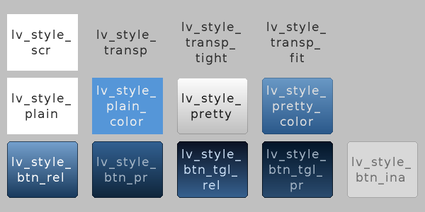
As you can see, there are built-in styles for screens, buttons, solid containers, and transparent containers.
The lv_style_transp, lv_style_transp_fit and lv_style_transp_tight differ only in paddings: for lv_style_transp_tight all paddings are zero, for lv_style_transp_fit only horizontal and vertical paddings are zero but has inner padding.
Important
Transparent built-in styles have glass = 1 by default which means these styles (e.g. their colors) won’t be inherited by children.
The built in styles are global lv_style_t variables. You can use them like:
lv_btn_set_style(obj, LV_BTN_STYLE_REL, &lv_style_btn_rel)
Create new styles
You can either modify the built-in styles or can create new styles.
When creating new styles, it’s recommended to first copy a built-in style with lv_style_copy(&dest_style, &src_style) to be sure all fields are initialized with the proper value.
Do not forget to initialize the new style as static or global. For example:
static lv_style_t my_red_style;
lv_style_copy(&my_red_style, &lv_style_plain);
my_red_style.body.main_color = LV_COLOR_RED;
my_red_style.body.grad_color = LV_COLOR_RED;
Style animations
You can change the styles with animations using lv_style_anim_...() function. The lv_style_anim_set_styles() uses 3 styles. Two styles are required to represent the start and end state, and a third style required for the animation.
Here is an example to show how it works.
lv_anim_t a;
lv_style_anim_init(&a);                                                 /*A basic initialization*/
lv_style_anim_set_styles(&a, &style_to_anim, &style_start, &style_end); /*Set the styles to use*/
lv_style_anim_set_time(&a, duration, delay);                           /*Set the duration and delay*/
lv_style_anim_create(&a);                                               /*Create the animation*/
Essentially, style_start and style_end remain unchanged, and style_to_anim is interpolated over the course of the animation.
See lv_core/lv_style.h to know the whole API of style animations.
Check Animations for more information.
Style example
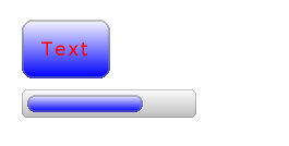
The example below demonstrates the usage of styles.

/*Create a style*/
static lv_style_t style1;
lv_style_copy(&style1, &lv_style_plain);    /*Copy a built-in style to initialize the new style*/
style1.body.main_color = LV_COLOR_WHITE;
style1.body.grad_color = LV_COLOR_BLUE;
style1.body.radius = 10;
style1.body.border.color = LV_COLOR_GRAY;
style1.body.border.width = 2;
style1.body.border.opa = LV_OPA_50;
style1.body.padding.left = 5;            /*Horizontal padding, used by the bar indicator below*/
style1.body.padding.right = 5;
style1.body.padding.top = 5;            /*Vertical padding, used by the bar indicator below*/
style1.body.padding.bottom = 5;
style1.text.color = LV_COLOR_RED;

/*Create a simple object*/
lv_obj_t *obj1 = lv_obj_create(lv_scr_act(), NULL);
lv_obj_set_style(obj1, &style1);                        /*Apply the created style*/
lv_obj_set_pos(obj1, 20, 20);                           /*Set the position*/

/*Create a label on the object. The label's style is NULL by default*/
lv_obj_t *label = lv_label_create(obj1, NULL);
lv_obj_align(label, NULL, LV_ALIGN_CENTER, 0, 0);       /*Align the label to the middle*/

/*Create a bar*/
lv_obj_t *bar1 = lv_bar_create(lv_scr_act(), NULL);
lv_bar_set_style(bar1, LV_BAR_STYLE_INDIC, &style1);    /*Modify the indicator's style*/
lv_bar_set_value(bar1, 70);                             /*Set the bar's value*/
Themes
Creating styles for the GUI is challenging because you need a deeper understanding of the library, and you need to have some design skills. Also, it takes a lot of time to create so many styles for many different objects.
Themes are introduced to speed up the design part. A theme is a style collection which contains the required styles for every object type. For example, 5 styles for a button to describe its 5 possible states. Check the Existing themes or try some in the Live demo section. The theme selector demo is useful to see how a given theme and color hue looks on the display.
To be more specific, a theme is a structure variable that contains a lot of lv_style_t * fields. For buttons:
theme.btn.rel       /*Released button style*/
theme.btn.pr        /*Pressed button style*/
theme.btn.tgl_rel   /*Toggled released button style*/
theme.btn.tgl_pr    /*Toggled pressed button style*/
theme.btn.ina       /*Inactive button style*/
A theme can initialized by: lv_theme_<name>_init(hue, font). Where hue is a Hue value from HSV color space (0..360) and font is the font applied in the theme (NULL to use the LV_FONT_DEFAULT)
When a theme is initialized its styles can be used like this:

/*Create a default slider*/
lv_obj_t *slider = lv_slider_create(lv_scr_act(), NULL);
lv_slider_set_value(slider, 70);
lv_obj_set_pos(slider, 10, 10);

/*Initialize the alien theme with a reddish hue*/
lv_theme_t *th = lv_theme_alien_init(10, NULL);

/*Create a new slider and apply the themes styles*/
slider = lv_slider_create(lv_scr_act(), NULL);
lv_slider_set_value(slider, 70);
lv_obj_set_pos(slider, 10, 50);
lv_slider_set_style(slider, LV_SLIDER_STYLE_BG, th->slider.bg);
lv_slider_set_style(slider, LV_SLIDER_STYLE_INDIC, th->slider.indic);
lv_slider_set_style(slider, LV_SLIDER_STYLE_KNOB, th->slider.knob);
You can ask the library to automatically apply the styles from a theme when you create new objects. To do this use lv_theme_set_current(th).
/*Initialize the alien theme with a reddish hue*/
lv_theme_t *th = lv_theme_alien_init(10, NULL);
lv_theme_set_current(th);

/*Create a slider. It will use the style from teh current theme.*/
slider = lv_slider_create(lv_scr_act(), NULL);
Themes can be enabled or disabled one by one in lv_conf.h.
Live update
By default, if lv_theme_set_current(th) is called again, it won’t refresh the styles of the existing objects. To enable live update of themes, enable LV_THEME_LIVE_UPDATE in lv_conf.h.
Live update will only update objects using the unchanged theme styles, i.e. objects created after the first call of lv_theme_set_current(th) or to which the theme’s styles were applied manually.