Button (lv_btn)
Overview
Buttons are simple rectangle-like objects. They are derived from Containers so layout and fit are also available. Besides, it can be enabled to automatically go to checked state on click.
Parts and Styles
The buttons has only a main style called LV_BTN_PART_MAIN and it can use all the properties from the following groups:
background
border
outline
shadow
value
pattern
transitions
It also uses the padding properties when layout or fit is enabled.
Usage
States
To make buttons usage simpler the button's state can be get with lv_btn_get_state(btn). It returns one of the following values:
LV_BTN_STATE_RELEASED
LV_BTN_STATE_PRESSED
LV_BTN_STATE_CHECKED_RELEASED
LV_BTN_STATE_CHECKED_PRESSED
LV_BTN_STATE_DISABLED
LV_BTN_STATE_CHECKED_DISABLED
With lv_btn_set_state(btn, LV_BTN_STATE_...) the buttons state can be changed manually.
If a more precise description of the state is required (e.g. focused) the general lv_obj_get_state(btn) can be used.
Checkable
You can configure the buttons as toggle button with lv_btn_set_checkable(btn, true). In this case, on click, the button goes to LV_STATE_CHECKED state automatically, or back when clicked again.
Layout and Fit
Similarly to Containers, buttons also have layout and fit attributes.
lv_btn_set_layout(btn, LV_LAYOUT_...)set a layout. The default isLV_LAYOUT_CENTER. So, if you add a label, then it will be automatically aligned to the middle and can't be moved withlv_obj_set_pos(). You can disable the layout withlv_btn_set_layout(btn, LV_LAYOUT_OFF).lv_btn_set_fit/fit2/fit4(btn, LV_FIT_..)enables to set the button width and/or height automatically according to the children, parent, and fit type.
Events
Besides the Generic events the following Special events are sent by the buttons:
LV_EVENT_VALUE_CHANGED - sent when the button is toggled.
Learn more about Events.
Keys
The following Keys are processed by the Buttons:
LV_KEY_RIGHT/UP - Go to toggled state if toggling is enabled.
LV_KEY_LEFT/DOWN - Go to non-toggled state if toggling is enabled.
Note that, the state of LV_KEY_ENTER is translated to LV_EVENT_PRESSED/PRESSING/RELEASED etc.
Learn more about Keys.
Example
C
Simple Buttons
code
#include "../../../lv_examples.h"
#include <stdio.h>
#if LV_USE_BTN

static void event_handler(lv_obj_t * obj, lv_event_t event)
{
    if(event == LV_EVENT_CLICKED) {
        printf("Clicked\n");
    }
    else if(event == LV_EVENT_VALUE_CHANGED) {
        printf("Toggled\n");
    }
}

void lv_ex_btn_1(void)
{
    lv_obj_t * label;

    lv_obj_t * btn1 = lv_btn_create(lv_scr_act(), NULL);
    lv_obj_set_event_cb(btn1, event_handler);
    lv_obj_align(btn1, NULL, LV_ALIGN_CENTER, 0, -40);

    label = lv_label_create(btn1, NULL);
    lv_label_set_text(label, "Button");

    lv_obj_t * btn2 = lv_btn_create(lv_scr_act(), NULL);
    lv_obj_set_event_cb(btn2, event_handler);
    lv_obj_align(btn2, NULL, LV_ALIGN_CENTER, 0, 40);
    lv_btn_set_checkable(btn2, true);
    lv_btn_toggle(btn2);
    lv_btn_set_fit2(btn2, LV_FIT_NONE, LV_FIT_TIGHT);

    label = lv_label_create(btn2, NULL);
    lv_label_set_text(label, "Toggled");
}
#endif
code
#include "../../../lv_examples.h"
#include <stdio.h>
#if LV_USE_BTN
/**
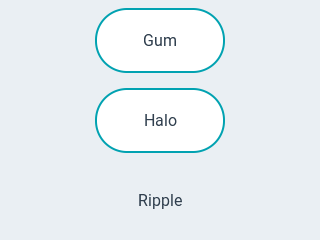
* Advanced button transition examples
*/
void lv_ex_btn_2(void)
{
static lv_anim_path_t path_overshoot;
lv_anim_path_init(&path_overshoot);
lv_anim_path_set_cb(&path_overshoot, lv_anim_path_overshoot);
static lv_anim_path_t path_ease_out;
lv_anim_path_init(&path_ease_out);
lv_anim_path_set_cb(&path_ease_out, lv_anim_path_ease_out);
static lv_anim_path_t path_ease_in_out;
lv_anim_path_init(&path_ease_in_out);
lv_anim_path_set_cb(&path_ease_in_out, lv_anim_path_ease_in_out);
/*Gum-like button*/
static lv_style_t style_gum;
lv_style_init(&style_gum);
lv_style_set_transform_width(&style_gum, LV_STATE_PRESSED, 10);
lv_style_set_transform_height(&style_gum, LV_STATE_PRESSED, -10);
lv_style_set_value_letter_space(&style_gum, LV_STATE_PRESSED, 5);
lv_style_set_transition_path(&style_gum, LV_STATE_DEFAULT, &path_overshoot);
lv_style_set_transition_path(&style_gum, LV_STATE_PRESSED, &path_ease_in_out);
lv_style_set_transition_time(&style_gum, LV_STATE_DEFAULT, 250);
lv_style_set_transition_delay(&style_gum, LV_STATE_DEFAULT, 100);
lv_style_set_transition_prop_1(&style_gum, LV_STATE_DEFAULT, LV_STYLE_TRANSFORM_WIDTH);
lv_style_set_transition_prop_2(&style_gum, LV_STATE_DEFAULT, LV_STYLE_TRANSFORM_HEIGHT);
lv_style_set_transition_prop_3(&style_gum, LV_STATE_DEFAULT, LV_STYLE_VALUE_LETTER_SPACE);
lv_obj_t * btn1 = lv_btn_create(lv_scr_act(), NULL);
lv_obj_align(btn1, NULL, LV_ALIGN_CENTER, 0, -80);
lv_obj_add_style(btn1, LV_BTN_PART_MAIN, &style_gum);
/*Instead of creating a label add a values string*/
lv_obj_set_style_local_value_str(btn1, LV_BTN_PART_MAIN, LV_STATE_DEFAULT, "Gum");
/*Halo on press*/
static lv_style_t style_halo;
lv_style_init(&style_halo);
lv_style_set_transition_time(&style_halo, LV_STATE_PRESSED, 400);
lv_style_set_transition_time(&style_halo, LV_STATE_DEFAULT, 0);
lv_style_set_transition_delay(&style_halo, LV_STATE_DEFAULT, 200);
lv_style_set_outline_width(&style_halo, LV_STATE_DEFAULT, 0);
lv_style_set_outline_width(&style_halo, LV_STATE_PRESSED, 20);
lv_style_set_outline_opa(&style_halo, LV_STATE_DEFAULT, LV_OPA_COVER);
lv_style_set_outline_opa(&style_halo, LV_STATE_FOCUSED, LV_OPA_COVER); /*Just to be sure, the theme might use it*/
lv_style_set_outline_opa(&style_halo, LV_STATE_PRESSED, LV_OPA_TRANSP);
lv_style_set_transition_prop_1(&style_halo, LV_STATE_DEFAULT, LV_STYLE_OUTLINE_OPA);
lv_style_set_transition_prop_2(&style_halo, LV_STATE_DEFAULT, LV_STYLE_OUTLINE_WIDTH);
lv_obj_t * btn2 = lv_btn_create(lv_scr_act(), NULL);
lv_obj_align(btn2, NULL, LV_ALIGN_CENTER, 0, 0);
lv_obj_add_style(btn2, LV_BTN_PART_MAIN, &style_halo);
lv_obj_set_style_local_value_str(btn2, LV_BTN_PART_MAIN, LV_STATE_DEFAULT, "Halo");
/*Ripple on press*/
static lv_style_t style_ripple;
lv_style_init(&style_ripple);
lv_style_set_transition_time(&style_ripple, LV_STATE_PRESSED, 300);
lv_style_set_transition_time(&style_ripple, LV_STATE_DEFAULT, 0);
lv_style_set_transition_delay(&style_ripple, LV_STATE_DEFAULT, 300);
lv_style_set_bg_opa(&style_ripple, LV_STATE_DEFAULT, 0);
lv_style_set_bg_opa(&style_ripple, LV_STATE_PRESSED, LV_OPA_80);
lv_style_set_border_width(&style_ripple, LV_STATE_DEFAULT, 0);
lv_style_set_outline_width(&style_ripple, LV_STATE_DEFAULT, 0);
lv_style_set_transform_width(&style_ripple, LV_STATE_DEFAULT, -20);
lv_style_set_transform_height(&style_ripple, LV_STATE_DEFAULT, -20);
lv_style_set_transform_width(&style_ripple, LV_STATE_PRESSED, 0);
lv_style_set_transform_height(&style_ripple, LV_STATE_PRESSED, 0);
lv_style_set_transition_path(&style_ripple, LV_STATE_DEFAULT, &path_ease_out);
lv_style_set_transition_prop_1(&style_ripple, LV_STATE_DEFAULT, LV_STYLE_BG_OPA);
lv_style_set_transition_prop_2(&style_ripple, LV_STATE_DEFAULT, LV_STYLE_TRANSFORM_WIDTH);
lv_style_set_transition_prop_3(&style_ripple, LV_STATE_DEFAULT, LV_STYLE_TRANSFORM_HEIGHT);
lv_obj_t * btn3 = lv_btn_create(lv_scr_act(), NULL);
lv_obj_align(btn3, NULL, LV_ALIGN_CENTER, 0, 80);
lv_obj_add_style(btn3, LV_BTN_PART_MAIN, &style_ripple);
lv_obj_set_style_local_value_str(btn3, LV_BTN_PART_MAIN, LV_STATE_DEFAULT, "Ripple");
}
#endif
MicroPython
Simple Buttons
Click to try in the simulator!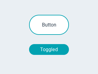
code
def event_handler(source,evt):
    if evt == lv.EVENT.CLICKED:
        if source == btn1:
            # treat "clicked" events only for btn1
            print("Clicked")
        elif evt == lv.EVENT.VALUE_CHANGED:
            print("Toggled")


# create a simple button
btn1 = lv.btn(lv.scr_act(),None)
# attach the callback
btn1.set_event_cb(event_handler)
btn1.align(None,lv.ALIGN.CENTER,0,-40)
label=lv.label(btn1,None)
label.set_text("Button")

# create a toggle button
btn2 = lv.btn(lv.scr_act(),None)
# attach the callback
btn2.set_event_cb(event_handler)
btn2.align(None,lv.ALIGN.CENTER,0,40)
btn2.set_checkable(True)
btn2.toggle()
#btn2.set_fit2(lv.FIT.NONE,lv.FIT.TIGHT)
label=lv.label(btn2,None)
label.set_text("Toggled")
code
path_overshoot = lv.anim_path_t()
path_overshoot.init()
path_overshoot.set_cb(lv.anim_path_t.overshoot)

path_ease_out = lv.anim_path_t()
path_ease_out.init()
path_overshoot.set_cb(lv.anim_path_t.ease_out)

path_ease_in_out = lv.anim_path_t()
path_ease_in_out.init()
path_overshoot.set_cb(lv.anim_path_t.ease_in_out)

# Gum line button
style_gum = lv.style_t()
style_gum.init()
style_gum.set_transform_width(lv.STATE.PRESSED, 10)
style_gum.set_transform_height(lv.STATE.PRESSED, -10)
style_gum.set_value_letter_space(lv.STATE.PRESSED, 5)
style_gum.set_transition_path(lv.STATE.DEFAULT,path_overshoot)
style_gum.set_transition_path(lv.STATE.PRESSED,path_ease_in_out)
style_gum.set_transition_time(lv.STATE.DEFAULT, 250)
style_gum.set_transition_delay(lv.STATE.DEFAULT, 100)
style_gum.set_transition_prop_1(lv.STATE.DEFAULT, lv.STYLE.TRANSFORM_WIDTH)
style_gum.set_transition_prop_2(lv.STATE.DEFAULT, lv.STYLE.TRANSFORM_HEIGHT)
style_gum.set_transition_prop_3(lv.STATE.DEFAULT, lv.STYLE.VALUE_LETTER_SPACE)

btn1 = lv.btn(lv.scr_act(),None)
btn1.align(None,lv.ALIGN.CENTER,0,-80)
btn1.add_style(lv.btn.PART.MAIN,style_gum)
# Instead of creating a label add a values string*
btn1.set_style_local_value_str(lv.btn.PART.MAIN, lv.STATE.DEFAULT, "Gum");

# Halo on press
style_halo=lv.style_t()
style_halo.init()
style_halo.set_transition_time(lv.STATE.PRESSED, 400)
style_halo.set_transition_time(lv.STATE.DEFAULT, 0)
style_halo.set_transition_delay(lv.STATE.DEFAULT, 200)
style_halo.set_outline_width(lv.STATE.DEFAULT, 0)
style_halo.set_outline_width(lv.STATE.PRESSED, 20)
style_halo.set_outline_opa(lv.STATE.DEFAULT, lv.OPA.COVER)
style_halo.set_outline_opa(lv.STATE.FOCUSED, lv.OPA.COVER)   # Just to be sure, the theme might use it
style_halo.set_outline_opa(lv.STATE.PRESSED, lv.OPA.TRANSP)
style_halo.set_transition_prop_1(lv.STATE.DEFAULT, lv.STYLE.OUTLINE_OPA)
style_halo.set_transition_prop_2(lv.STATE.DEFAULT, lv.STYLE.OUTLINE_WIDTH)

btn2=lv.btn(lv.scr_act(), None);
btn2.align(None, lv.ALIGN.CENTER, 0, 0);
btn2.add_style(lv.btn.PART.MAIN, style_halo);
btn2.set_style_local_value_str(lv.btn.PART.MAIN, lv.STATE.DEFAULT, "Halo");

# Ripple on press
style_ripple=lv.style_t()
style_ripple.init()
style_ripple.set_transition_time(lv.STATE.PRESSED, 300)
style_ripple.set_transition_time(lv.STATE.DEFAULT, 0)
style_ripple.set_transition_delay(lv.STATE.DEFAULT, 300)
style_ripple.set_bg_opa(lv.STATE.DEFAULT, 0)
style_ripple.set_bg_opa(lv.STATE.PRESSED, lv.OPA._80)
style_ripple.set_border_width(lv.STATE.DEFAULT, 0)
style_ripple.set_outline_width(lv.STATE.DEFAULT, 0)
style_ripple.set_transform_width(lv.STATE.DEFAULT, -20)
style_ripple.set_transform_height(lv.STATE.DEFAULT, -20)
style_ripple.set_transform_width(lv.STATE.PRESSED, 0)
style_ripple.set_transform_height(lv.STATE.PRESSED, 0)

style_ripple.set_transition_path(lv.STATE.DEFAULT, path_ease_out)
style_ripple.set_transition_prop_1(lv.STATE.DEFAULT, lv.STYLE.BG_OPA)
style_ripple.set_transition_prop_2(lv.STATE.DEFAULT, lv.STYLE.TRANSFORM_WIDTH)
style_ripple.set_transition_prop_3(lv.STATE.DEFAULT, lv.STYLE.TRANSFORM_HEIGHT)

btn3 = lv.btn(lv.scr_act(), None)
btn3.align(None, lv.ALIGN.CENTER, 0, 80)
btn3.add_style(lv.btn.PART.MAIN, style_ripple)
btn3.set_style_local_value_str(lv.btn.PART.MAIN, lv.STATE.DEFAULT, "Ripple")
API
Enums
-
enum [anonymous]
Possible states of a button. It can be used not only by buttons but other button-like objects too
Values:
-
enumerator
LV_BTN_STATE_RELEASED
-
enumerator
LV_BTN_STATE_PRESSED
-
enumerator
LV_BTN_STATE_DISABLED
-
enumerator
LV_BTN_STATE_CHECKED_RELEASED
-
enumerator
LV_BTN_STATE_CHECKED_PRESSED
-
enumerator
LV_BTN_STATE_CHECKED_DISABLED
-
enumerator
_LV_BTN_STATE_LAST
-
enumerator
Functions
-
lv_obj_t *
lv_btn_create(lv_obj_t *par, const lv_obj_t *copy)¶ Create a button object
- Parameters
par -- pointer to an object, it will be the parent of the new button
copy -- pointer to a button object, if not NULL then the new object will be copied from it
- Returns
pointer to the created button
-
void
lv_btn_set_checkable(lv_obj_t *btn, bool tgl)¶ Enable the toggled states. On release the button will change from/to toggled state.
- Parameters
btn -- pointer to a button object
tgl -- true: enable toggled states, false: disable
-
void
lv_btn_set_state(lv_obj_t *btn, lv_btn_state_t state)¶ Set the state of the button
- Parameters
btn -- pointer to a button object
state -- the new state of the button (from lv_btn_state_t enum)
-
void
lv_btn_toggle(lv_obj_t *btn)¶ Toggle the state of the button (ON->OFF, OFF->ON)
- Parameters
btn -- pointer to a button object
-
static inline void
lv_btn_set_layout(lv_obj_t *btn, lv_layout_t layout)¶ Set the layout on a button
- Parameters
btn -- pointer to a button object
layout -- a layout from 'lv_cont_layout_t'
-
static inline void
lv_btn_set_fit4(lv_obj_t *btn, lv_fit_t left, lv_fit_t right, lv_fit_t top, lv_fit_t bottom)¶ Set the fit policy in all 4 directions separately. It tells how to change the button size automatically.
- Parameters
btn -- pointer to a button object
left -- left fit policy from
lv_fit_tright -- right fit policy from
lv_fit_ttop -- top fit policy from
lv_fit_tbottom -- bottom fit policy from
lv_fit_t
-
static inline void
lv_btn_set_fit2(lv_obj_t *btn, lv_fit_t hor, lv_fit_t ver)¶ Set the fit policy horizontally and vertically separately. It tells how to change the button size automatically.
- Parameters
btn -- pointer to a button object
hor -- horizontal fit policy from
lv_fit_tver -- vertical fit policy from
lv_fit_t
-
static inline void
lv_btn_set_fit(lv_obj_t *btn, lv_fit_t fit)¶ Set the fit policy in all 4 direction at once. It tells how to change the button size automatically.
- Parameters
btn -- pointer to a button object
fit -- fit policy from
lv_fit_t
-
lv_btn_state_t
lv_btn_get_state(const lv_obj_t *btn)¶ Get the current state of the button
- Parameters
btn -- pointer to a button object
- Returns
the state of the button (from lv_btn_state_t enum) If the button is in disabled state
LV_BTN_STATE_DISABLEDwill be ORed to the other button states.
-
bool
lv_btn_get_checkable(const lv_obj_t *btn)¶ Get the toggle enable attribute of the button
- Parameters
btn -- pointer to a button object
- Returns
true: checkable enabled, false: disabled
-
static inline lv_layout_t
lv_btn_get_layout(const lv_obj_t *btn)¶ Get the layout of a button
- Parameters
btn -- pointer to button object
- Returns
the layout from 'lv_cont_layout_t'
-
static inline lv_fit_t
lv_btn_get_fit_left(const lv_obj_t *btn)¶ Get the left fit mode
- Parameters
btn -- pointer to a button object
- Returns
an element of
lv_fit_t
-
static inline lv_fit_t
lv_btn_get_fit_right(const lv_obj_t *btn)¶ Get the right fit mode
- Parameters
btn -- pointer to a button object
- Returns
an element of
lv_fit_t
-
struct
lv_btn_ext_t¶ - #include <lv_btn.h>
Extended data of button